Progress Report May 2020
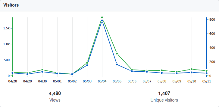
The last month’s progress report was mostly about enhancements of the python module. This month instead, development was focused on the user interface. Apart from that, Horizon EDA got submitted to Hacker News (not by me) and made it to the frontpage on May, 4th.
As to be expected, this lead to a significant spike in visitors to the github repo
(there are no stats for
Progressive model loading in 3D preview
Ever since the 3D preview supported showing 3D models, waiting for them to load was an exercise in patience as there was no progress indication whatsoever, apart from the spinner animation which itself is an euphemism of the hourglass icon from the ’90s.
To shorten the perceived loading time, the models are now shown right after they’ve been loaded and the loading indicator grew a progress bar. Since low-complexity models such as resistors and capacitors usually account for the majority of packages on a board, it’s desirable that these get loaded and shown first. This is accomplished by sorting the models by file size, hoping that small models will load faster than larger ones. Tests with real-world boards proved that this works surprisingly well.
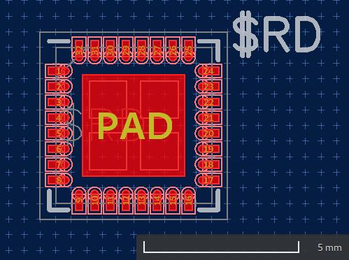
Scale bar in preview canvas
People suggested adding a bar scale to package previews to get a better sense of size of the thing they’re looking at. As this seemed like a good idea to me, I went ahead and implemented it. The bar only updates with a slight delay as updating it while the smooth zoom animation is running lead to some visually distracting effects since the scale bar first grew bigger but than snapped back to a smaller size as it switched to another scale.
Shortcuts in context menu
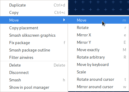
After finding out that I could just pack a GtkBox inside a
GtkMenuItem to show two labels in a menu item, showing shortcuts in
the context menu was a piece of
cake.
Minimum line width in canvas
On IRC, Robin suggested adding an option for setting the line width for zero-width lines. Luckily that idea was in my stash of things I might do if someone other than me thinks it’s worthwhile. Since we have antialiasing, fractional line widths are supported as well.
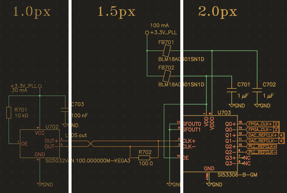
(For best effect, view the image at original size)
Part wizard in parts tab
Since its inception, the part wizard button was located in the packages tab because the first step in creating a part with the wizard is selecting a package and I was to lazy to add a package selector to the wizard back then.
This however wasn’t quite optimal from user’s perspective since the part wizard clearly belongs to the parts tab, so it gained a another step to select the package and its button got moved where it belongs.
Redesigned unit and entity editors
Motivated by Tim’s usability feedback, I had a go at revamping the unit and entity editors that both haven’t seen much development in their existence.
The unit editor now uses a tabular layout rather than repeating the headers every row. The swap group option got removed since pin swapping still isn’t implemented and is unlikely to make it in the near future.
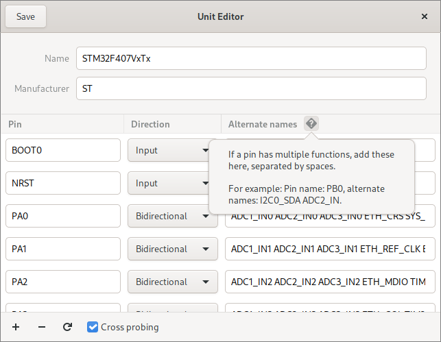
To make it easier to locate pins in the unit editor when editing a unit’s symbol, it gained support for cross-probing in that way, that the selection in the unit editor follows the selection in the symbol editor.
The entity editor followed suit:
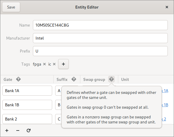
As it’s show in both screenshots above, the editors now have built-in help explaining the purpose of fields that aren’t immediately obvious.
Gate swapping
When redesigning the entity editor I was faced with the decision of either removing the gate swap option (similar to the unit editor) or finally implementing gate swapping. I chose the latter, so we now have gate swapping!
Resizeable tool popover
The tool popover’s size can now be adjusted by dragging its lower border. The implementation is a bit hacky since popovers don’t support interactive resizing out of the box, but works surprisingly well if the popover opens downwards.
Reload netlist hint
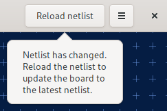
To remind (new) users to reload the netlist in the board after saving the schematic, the board editor now shows a popver when the schematic got saved:
Action bar
By far the biggest change that happened this month was the addition of the action bar that makes commonly-used tools more discoverable.

Less-often needed actions are accessible from menus that can be opened in three ways:
- Clicking on the arrow in the bottom-right corner of the button
- Right-clicking on the button
- Clicking on the button and dragging to the right
The whole thing is loosely inspired by blender’s toolbar that appeared in version 2.8. Special thanks go to @atoav for the ideas and suggestions provided in the issue.
Redesigned preferences
Sparsely populated pages in the preferences window got merged into a new “Editor” page:
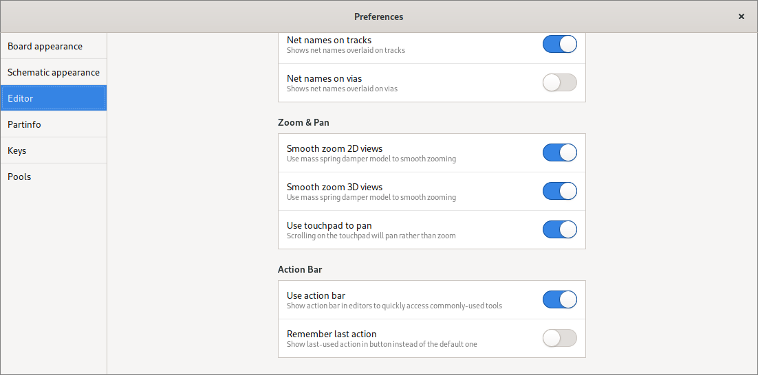
This was triggered by the addition of the action bar since adding a new page for just two switches seemed a bit silly.
KiCad symbol import
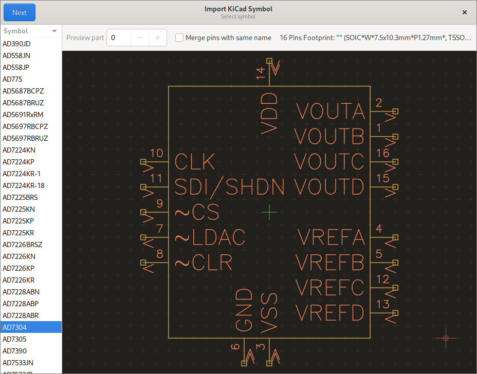
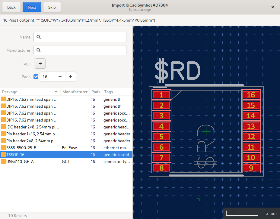
To make use of KiCad’s extensive symbol library and symbols provided by manufacturers, Horizon EDA now supports importing KiCad symbols. Importing a symbol provides all information necessary for creating unit, symbol and entity. When specifying a package during import a part with the pad mapping taken from the symbol will be created as well.
Even though (almost?) all data from the symbol is used, there are still some things the user needs to do such as repositioning pins. The import is handled by a wizard similar to the part wizard:
After picking the library file, the user gets to select the symbol they’d like to import:
The next step then is to pick a package. This is simplified by filtering based on the number of pins in the symbol:
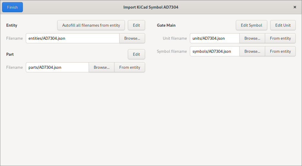
Finally, the part, entity, etc. are created and the user gets a chance to review and complete these:
View options menu
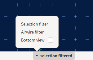
To make useful options such as selection filter, airwire filter and bottom view more easily discoverable, the view hints label in the status bar grew a menu:
