Progress Report June - August 2021 (What's new in Version 2.1)
Arc selection
Being able to select what’s on screen is essential to any 2D or 3D manipulation application, naturally Horizon EDA is no different in that regard. That’s why it was one of the first things that got implemented after some basic drawing methods were in place.
To keep implementation complexity low and quickly move on to other aspects of the application, selection was accomplished by axis-aligned bounding boxes.
Unfortunately, this approach works least best for objects at a 45° angle such as tracks since the bounding box will be much larger than the actual object, so in late 2017 selection boxes were enhanced to be rotated bounding boxes.
Apart from a couple of minor enhancements, there haven’t been any major changes to selection boxes since then as rotated bounding boxes work well for anything roughly rectangular.
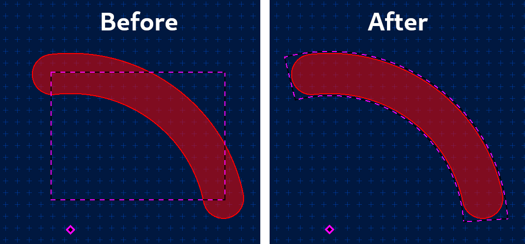
Arcs however, weren’t supported that well, as they poorly fit into a bounding box. Also, polygon arcs weren’t selectable at all.
To improve on that, the selectables got enhanced to to be able to take the shape of an arc. As with bounding boxes, it’s fast and easy to check if the cursor is inside of the arc. Similar to how arcs are rendered, the geometry shader emits a equilateral triangle that’s turned into an arc by the fragment shader.

On top of that, polygon arcs are now selectable as well.
3D preview keybindings
As suggested by matt-roberts in issue 584, the 3D preview now supports keyboard shortcuts for commonly used actions such as zooming/panning and switching between projections.
Grid switching
There are many good reasons for using more than one grid on a board, for example to cleanly route next to parts of metric and imperial pitch. Since I deemed supporting local grids wasn’t worth the added complexity, we now have a way of quickly switching between saved grids.
Where to find it: Expand the grid settings in the top left corner and click on the button with the three dots. Use the select grid action to switch grids.
Appearance of composite pads
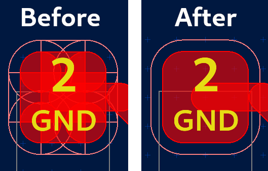
One of the key differentiating features of Horizon EDA has always been that it doesn’t have a concept of built-in pad shapes. Instead, each pad in a package is defined by a padstack. A padstack in turn is made up of primitive shapes (circle, rectangle, obround) and polygons. So instead of a built-in rectangular pad with rounded corners, there is a padstack consisting of two rectangles and four circles. As seen in the “before” screenshot below, they’re also drawn as such, leading to a rather messy appearance, especially for layers drawn in outline mode. free_electron mentioning this on the EEVBlog forum finally got me motivated to do something about it.

The key to achieving the desired result is not drawing the outline of objects if it is inside of a filled area. This is accomplished by stencil testing: In the first pass, only the insides of all objects making up pads are drawn and the stencil buffer is written to. In the second pass, all pads are drawn again and stencil testing makes sure that all fragments that fall inside of the areas that were drawn before are discarded. This ensures that there no outlines inside of the filled parts.
Key hint popup
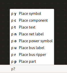
free_electron suggested showing a list of key sequences after the user has pressed at least one key. Since that suggestion made sense to me, I went ahead and implemented it:

The popup only appears after a slight delay, so experienced users entering the entire sequence in one go don’t get distracted by the popup appearing and disappearing a split second later.
Plane priorities
The correct assignment of plane priorities has always been one of the less intuitive aspects of the application. To provide some explanation on what plane priorities are all about, the plane editor grew a help popover a while ago. The plane priority defines in which order planes get filled in. This is particularly important for overlapping planes as it decides which plane “wins” in the overlapping areas. It’s also worth noting that planes of the same priority get filled in one go, so they aren’t aware of each other as they’re being filled. For overlapping planes, that means that the calculated fragments will overlap, leading to DRC errors down the road.
Plane priorities are also crucial for Gerber export. The Gerber file format doesn’t really support polygons with holes in them as they’re needed for planes. One way to achieve the desired effect is to draw a polygon with the polarity set to “light”, erasing anything everything beneath it that has been drawn before. This means that that a plane existing inside a hole of another plane needs a higher priority since it’d otherwise be erased by the light polarity polygon used to draw the hole.
The topic of plane priorities recently gained my attention when frmdstryr posted about planes not being filled properly in the exporter gerber even though showing up correctly in the board editor and 3D preview.
Upon investigating the design files, it became clear that they had run into an edge case I haven’t yet thought of: Usually overlapping planes of the same priority will result in DRC errors as mentioned above. In this particular case however the plane was surrounded by track that prevented the surrounding plane’s fragments from overlapping with the inner plane. In Gerber export, this then resulted in some of the inner planes not appearing filled as they were erased by the light polarity polygons of the surrounding plane.
Rather than relying on the user to get all of this right (and blaming them when they don’t), we now have a new check that ensures all plane’s priorities conform to the requirements described above.
On top of that, plane priorities were renamed to “fill order” in the UI as at least one user got confused about a lower priority number corresponding to a higher priority. I recall someone having suggested this before.
Automatically fix gitignore
The introduction of project pools results in every project containing a
pool with the requisite SQLite databases. As they’re only used for
caching purposes, they should be included in the project’s
.gitingore. When creating a new project, the project manager already
takes care of this. For projects migrated from version 1.4 or earlier,
though it was up to the user to add the database files to the
.gitingore.
To automate this tedious task, the project manager detects if a
recommended line is missing from the .gitingore and offers adding
them:

Version 2.1
About 3 months after the release of version 2.0, it’s time for a new release. Rather than adding exciting new features, version 2.1 is mostly about incremental usability and discoverability enhancements.
What’s next
For quite some time now, people have been asking for hierarchical schematics. About equally as long, I’ve been thinking off-and-on about how to best go about implementing it. Once I made up my mind, I went ahead and implemented it over the course of about a month.
Even though the implementation is mostly done by now, I decided to not include it into this release so it receives some more testing by a wider audience. Apart from that, this results in version “H” bringing support for hierarchical schematics.